Inclusive Design Thinking beyond accessibility drupalcampnj.org/node/57 @DrupalCampNJ
Slide 1
Slide 2
Mike Miles Genuine (wearegenuine.com) Dev(up); (developingup.com) All the internet places: mikemiles86
Slide 3
We all have one thing in common We want to make a positive impact on as many people as possible
Slide 4
Inclusive Design is… Planning considerations to ensure that a product, service and/or environment is usable by everyone to the greatest extent possible.
Slide 5
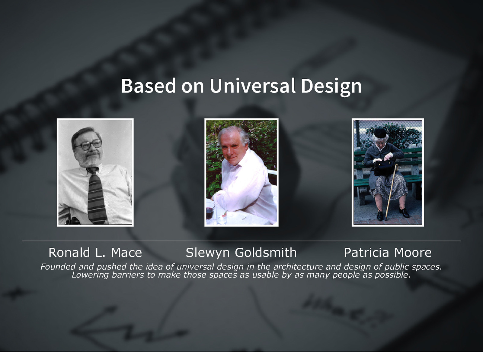
Based on Universal Design Ronald L. Mace Slewyn Goldsmith Patricia Moore Founded and pushed the idea of universal design in the architecture and design of public spaces. Lowering barriers to make those spaces as usable by as many people as possible.
Slide 6
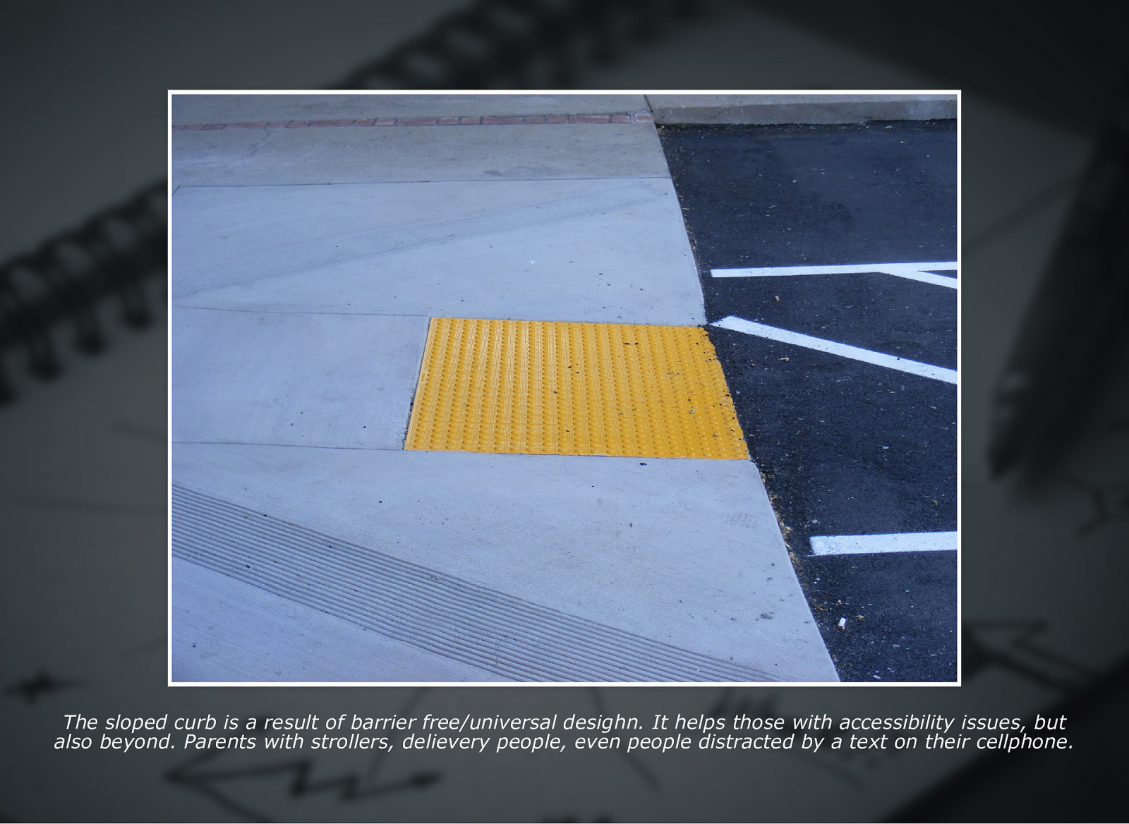
The sloped curb is a result of barrier free/universal desighn. It helps those with accessibility issues, but also beyond. Parents with strollers, delievery people, even people distracted by a text on their cellphone.
Slide 7
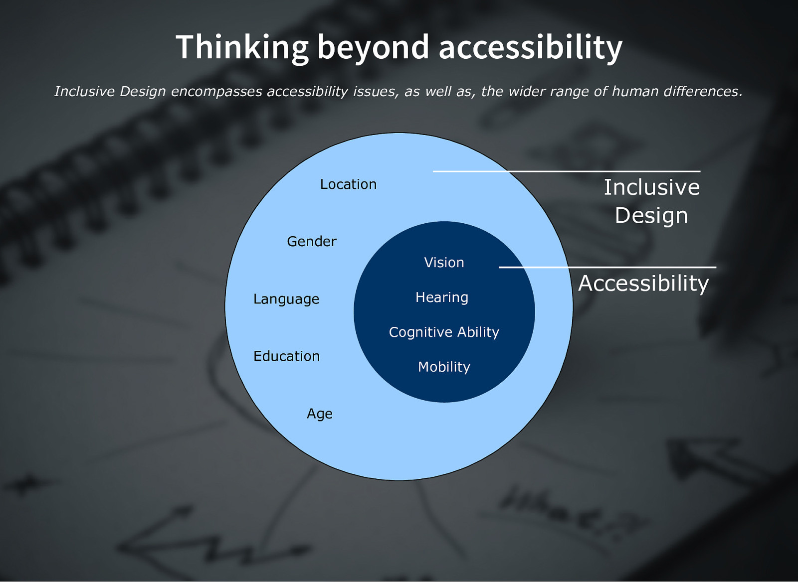
Thinking beyond accessibility Inclusive Design encompasses accessibility issues, as well as, the wider range of human differences. Inclusive Design Location Gender Vision Language Hearing Cognitive Ability Education Age Mobility Accessibility
Slide 8

Slide 9
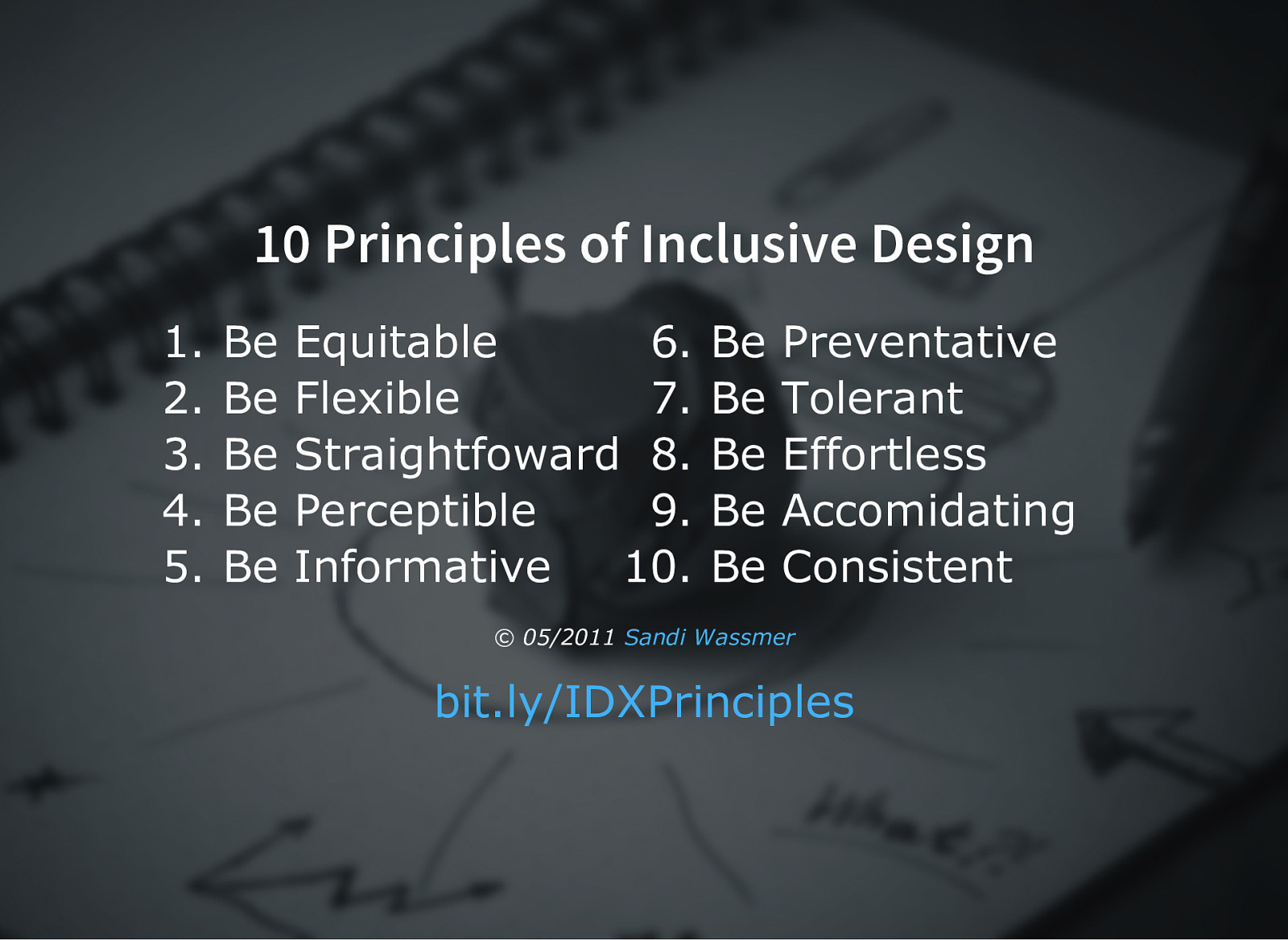
10 Principles of Inclusive Design 1. 2. 3. 4. 5. Be Be Be Be Be Equitable 6. Flexible 7. Straightfoward 8. Perceptible 9. Informative 10. Be Be Be Be Be Preventative Tolerant Effortless Accomidating Consistent © 05/2011 Sandi Wassmer bit.ly/IDXPrinciples
Slide 10
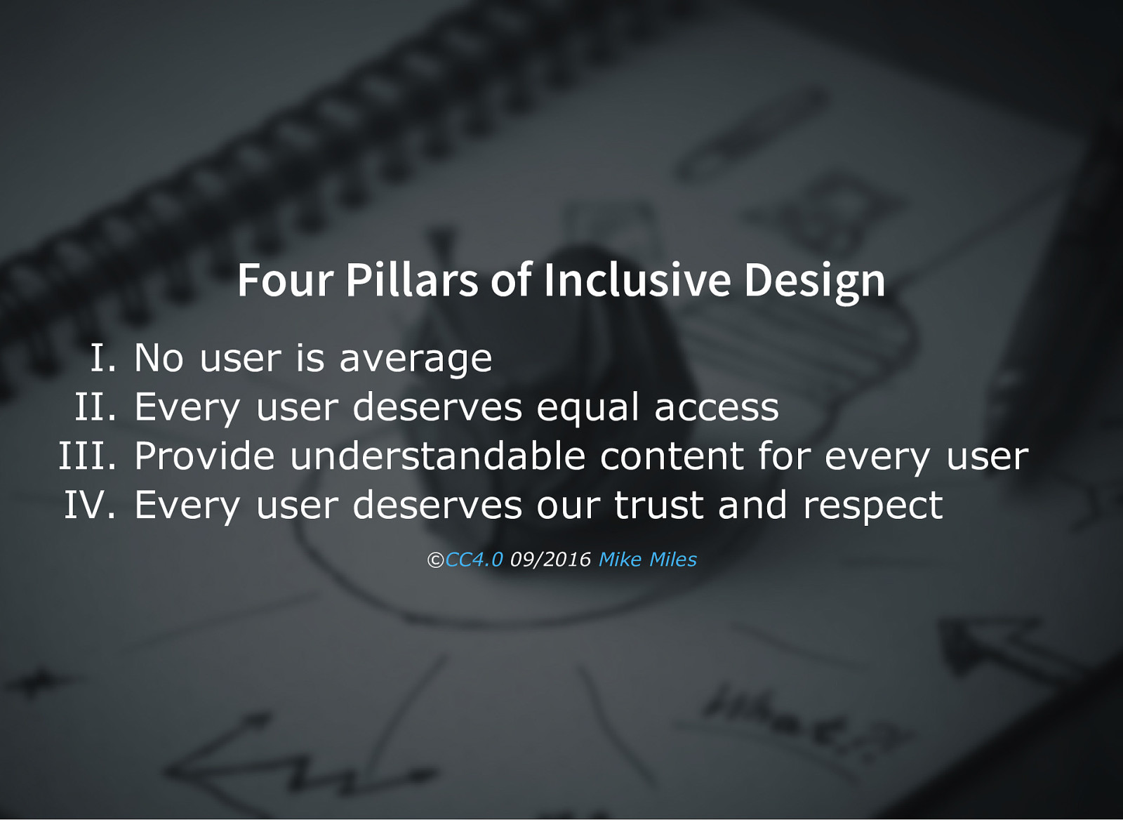
Four Pillars of Inclusive Design I. II. III. IV. No user is average Every user deserves equal access Provide understandable content for every user Every user deserves our trust and respect ©CC4.0 09/2016 Mike Miles
Slide 11

I. No user is average
Slide 12

In 1952 the Air force had a problem, their new jets were not performing well. The issue? The cockpit was designed for the “average” pilot, for someone who did not exist. It was not until they designed to accomidate the actual differences of pilots did performance improve.
Slide 13
The Myth of Average “If you design for the average, you are literally designing for nobody.” Todd Rose bit.ly/IDXAvgMyth
Slide 14
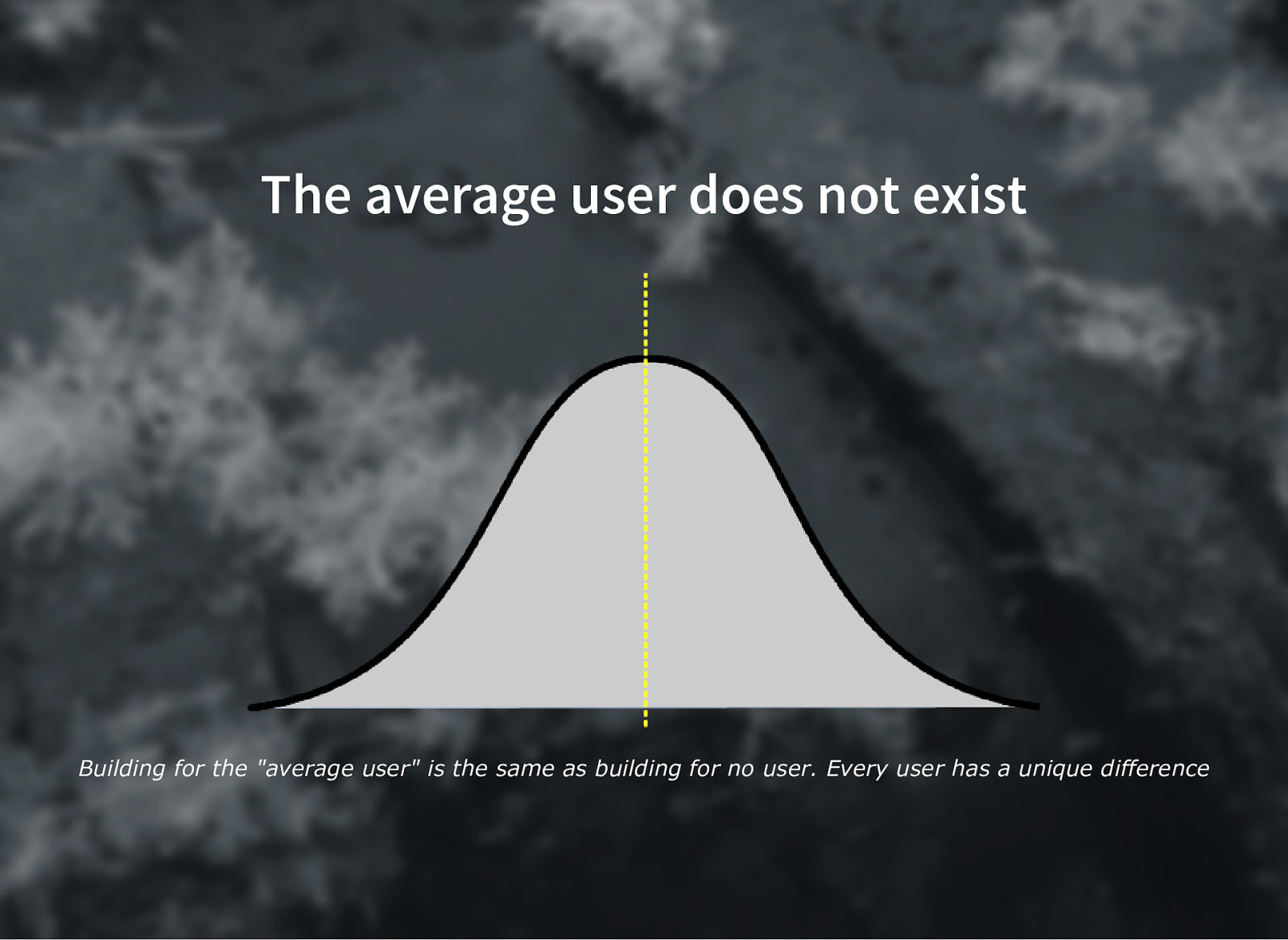
The average user does not exist Building for the “average user” is the same as building for no user. Every user has a unique difference
Slide 15
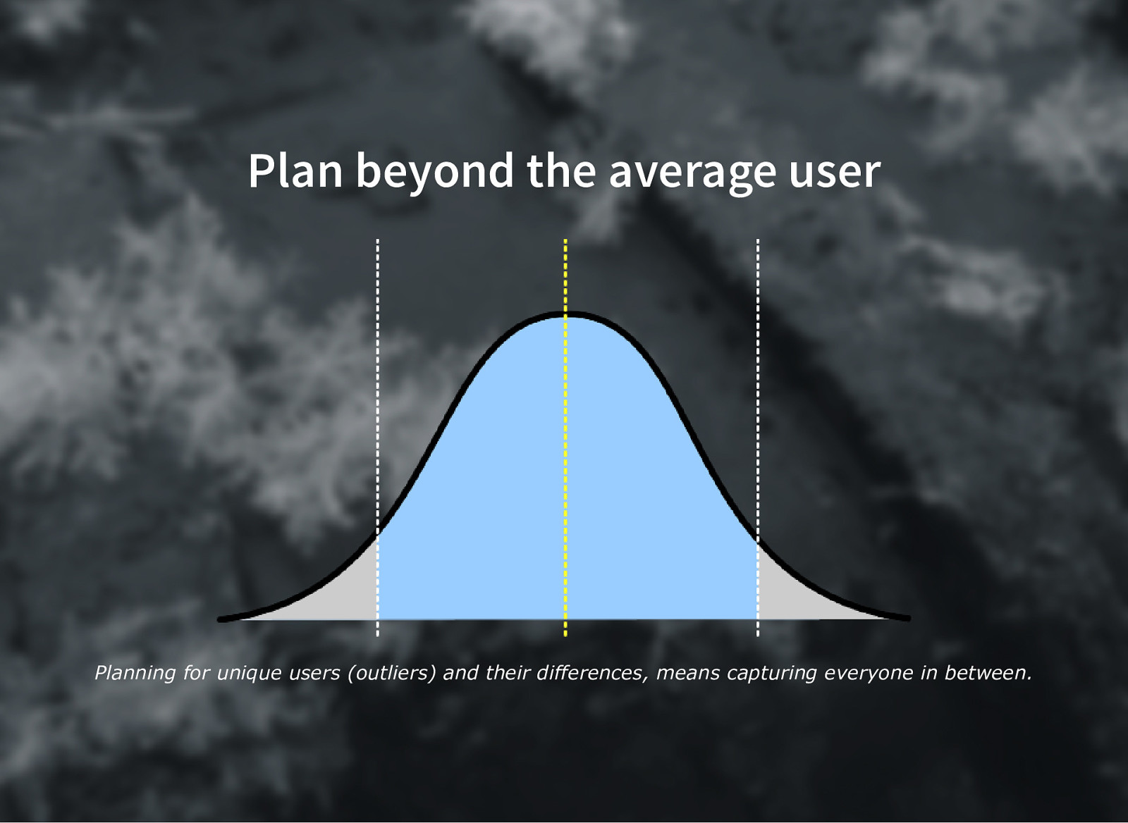
Plan beyond the average user Planning for unique users (outliers) and their differences, means capturing everyone in between.
Slide 16
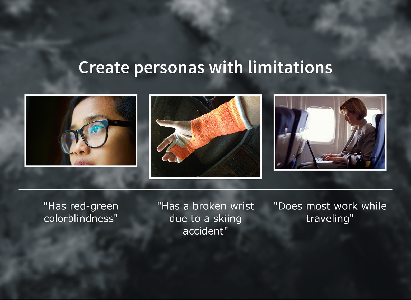
Create personas with limitations “Has redgreen colorblindness” “Has a broken wrist due to a skiing accident” “Does most work while traveling”
Slide 17
II. Every user deserves equal access
Slide 18
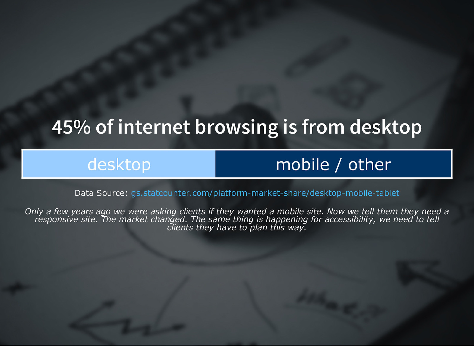
45% of internet browsing is from desktop desktop mobile / other Data Source: gs.statcounter.com/platformmarketshare/desktopmobiletablet Only a few years ago we were asking clients if they wanted a mobile site. Now we tell them they need a responsive site. The market changed. The same thing is happening for accessibility, we need to tell clients they have to plan this way.
Slide 19
Structure in a way that makes sense Use semantic markup, bit.ly/IDXSemBBC Use progressive design to deliver experience Prioritize what needs to be loaded
Slide 20
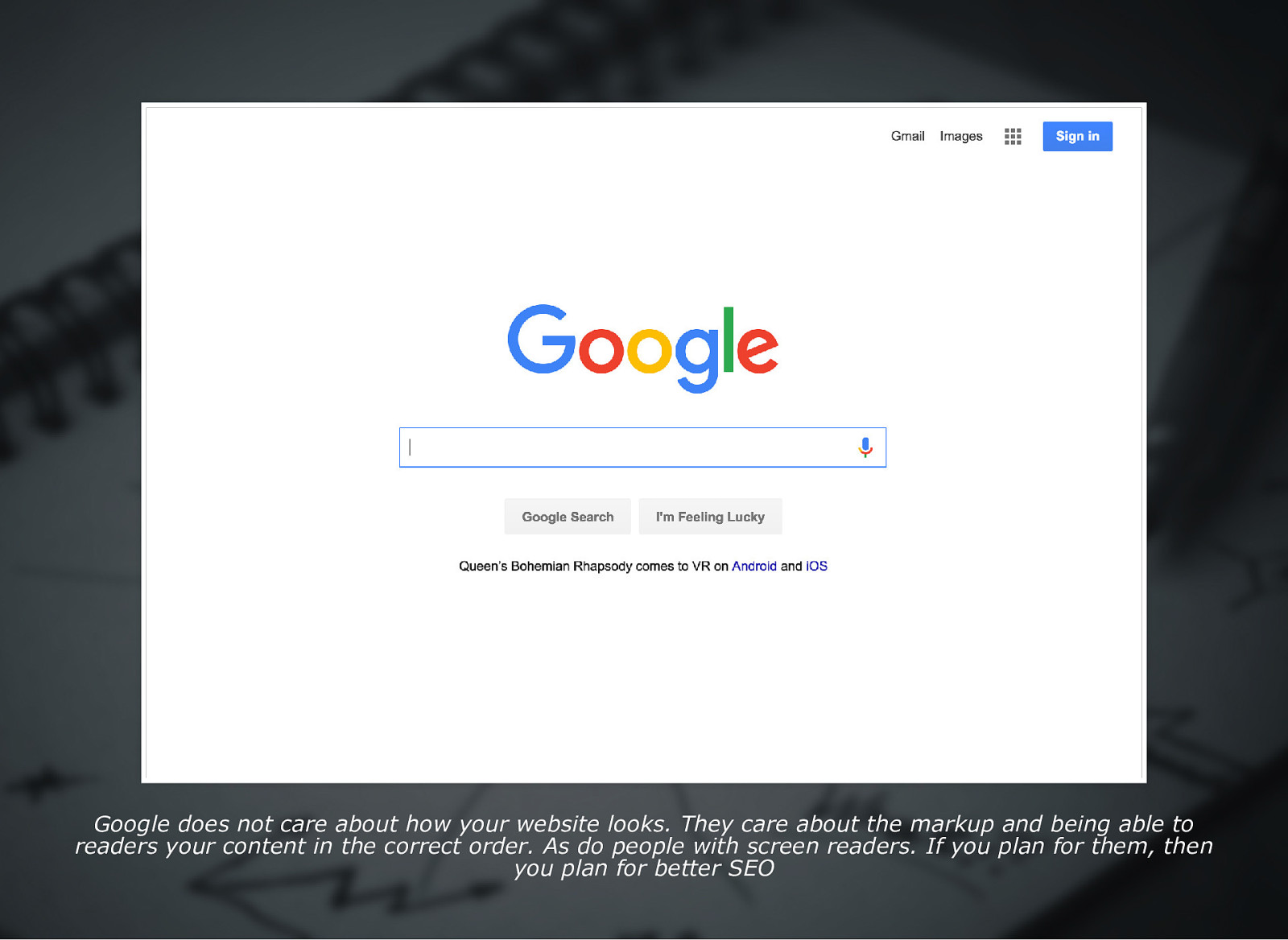
Google does not care about how your website looks. They care about the markup and being able to readers your content in the correct order. As do people with screen readers. If you plan for them, then you plan for better SEO
Slide 21

Average global internet speed: 6.3Mbps Republic of Mali South Korea 0.5 Mbps 26.3 Mbps Data Source: www.fastmetrics.com/internetconnectionspeedbycountry.php#top10comparison If you just build for South Korea, people in Mali are going to have a poor expirence. However, if you plan and build for people in Mali then everyone is going to have a positive experience.
Slide 22
Artificially limit yourself Use tools to throttle connection Disable JavaScript Can you navigate without a mouse?
Slide 23
III. Provide understandable content to every user
Slide 24
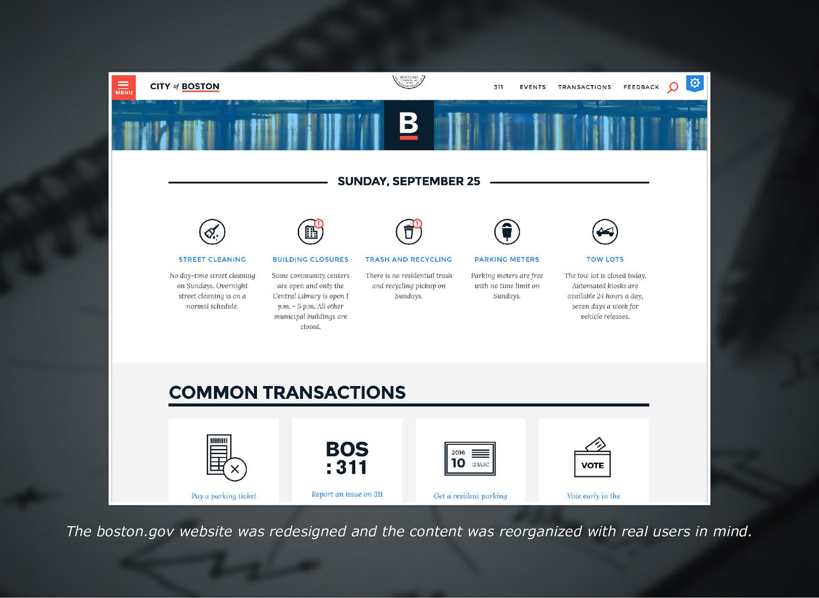
The boston.gov website was redesigned and the content was reorganized with real users in mind.
Slide 25
“The website should act like a helpful human. This is one of the big differences between the old site and the new site… on the old site, it would feel like you were interacting with some sort of lawyerrobot that was speaking to you in governmentspeak” Jascha FranklinHodge, the city’s chief of information technology Source: The Boston Globe
Slide 26
Be clear and direct Use simple phrasing and avoid jargon Pay attention to font, spacing, line length Be meaningful, tools to check readability
Slide 27
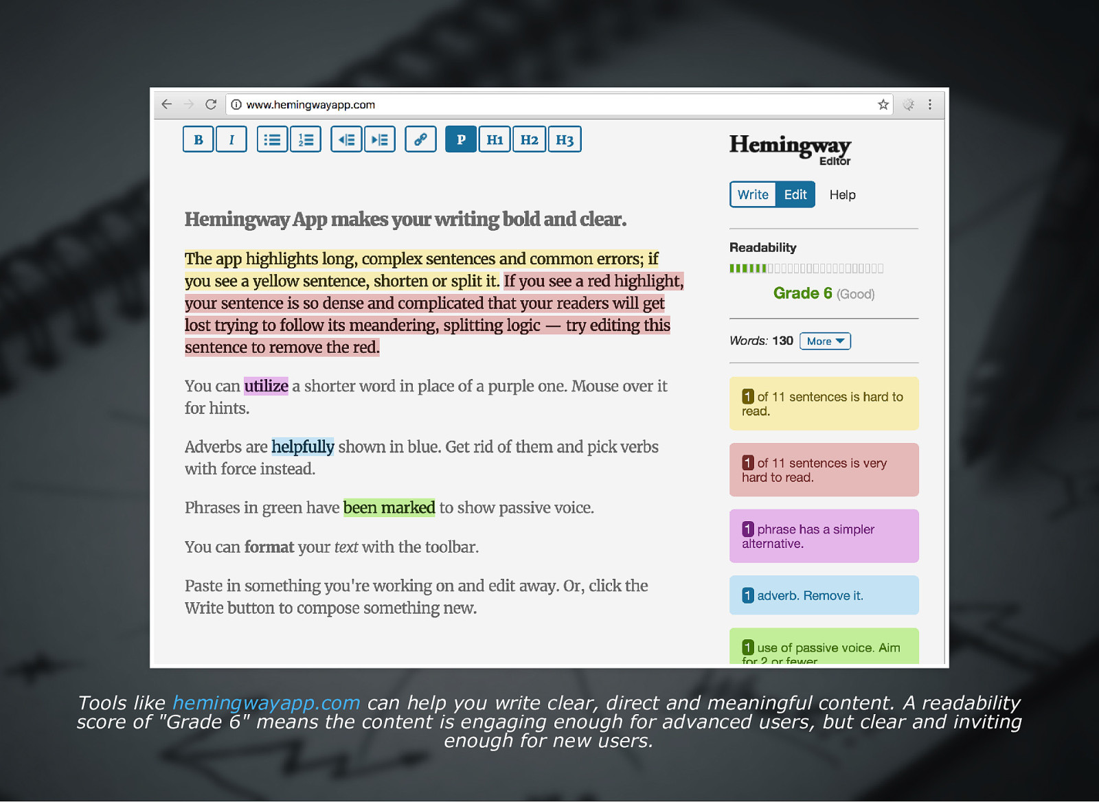
Tools like hemingwayapp.com can help you write clear, direct and meaningful content. A readability score of “Grade 6” means the content is engaging enough for advanced users, but clear and inviting enough for new users.
Slide 28
Inform and guide Display useful error messaging Plan a user’s journey Provide contextual relations
Slide 29
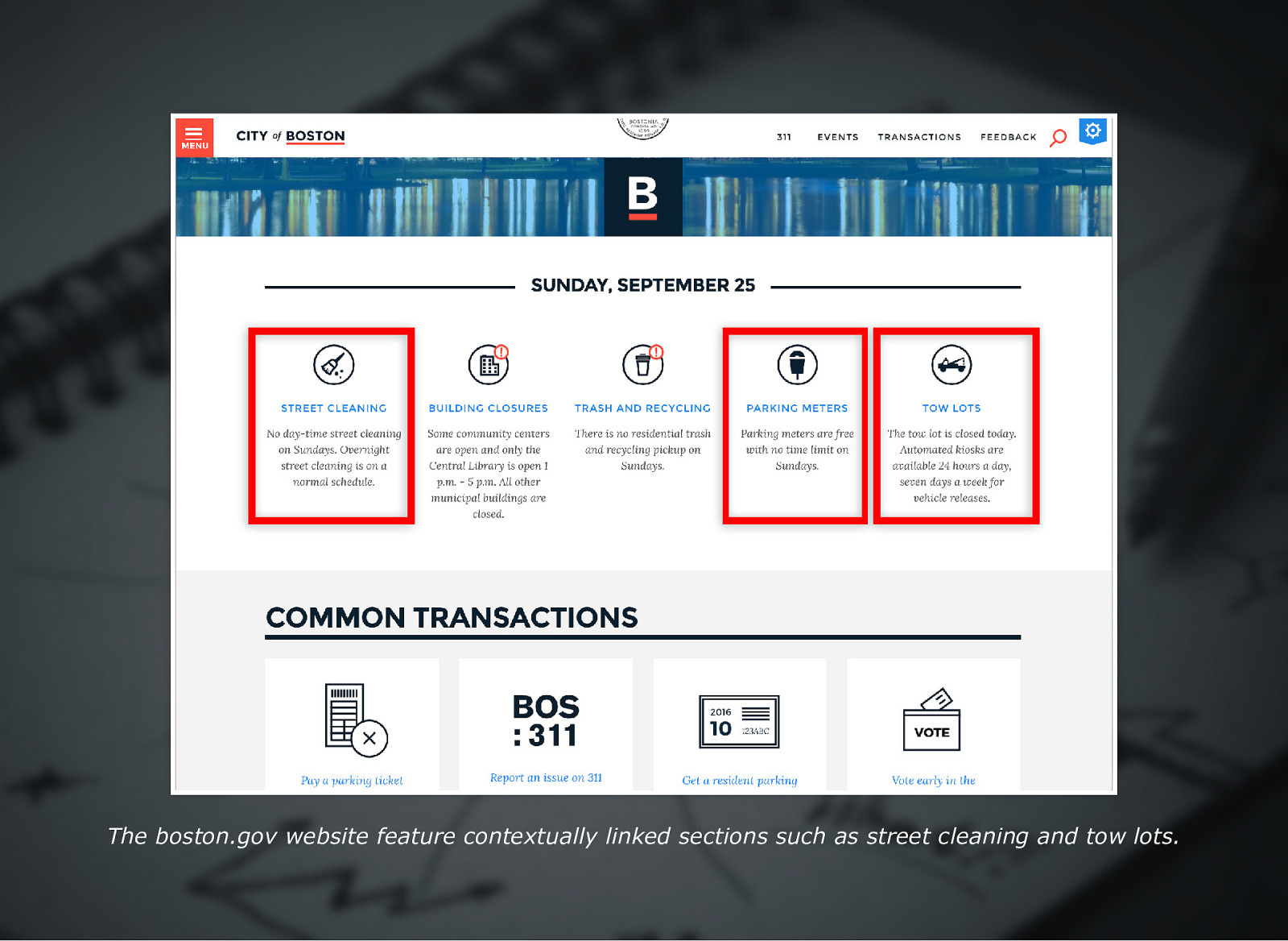
The boston.gov website feature contextually linked sections such as street cleaning and tow lots.
Slide 30

IV. Provide every user with trust and respect
Slide 31
Inclusive Design: Excluding no gender “The easiest way to do inclusive design? Stop asking about gender!” Sarah Leren bit.ly/IDXGender
Slide 32
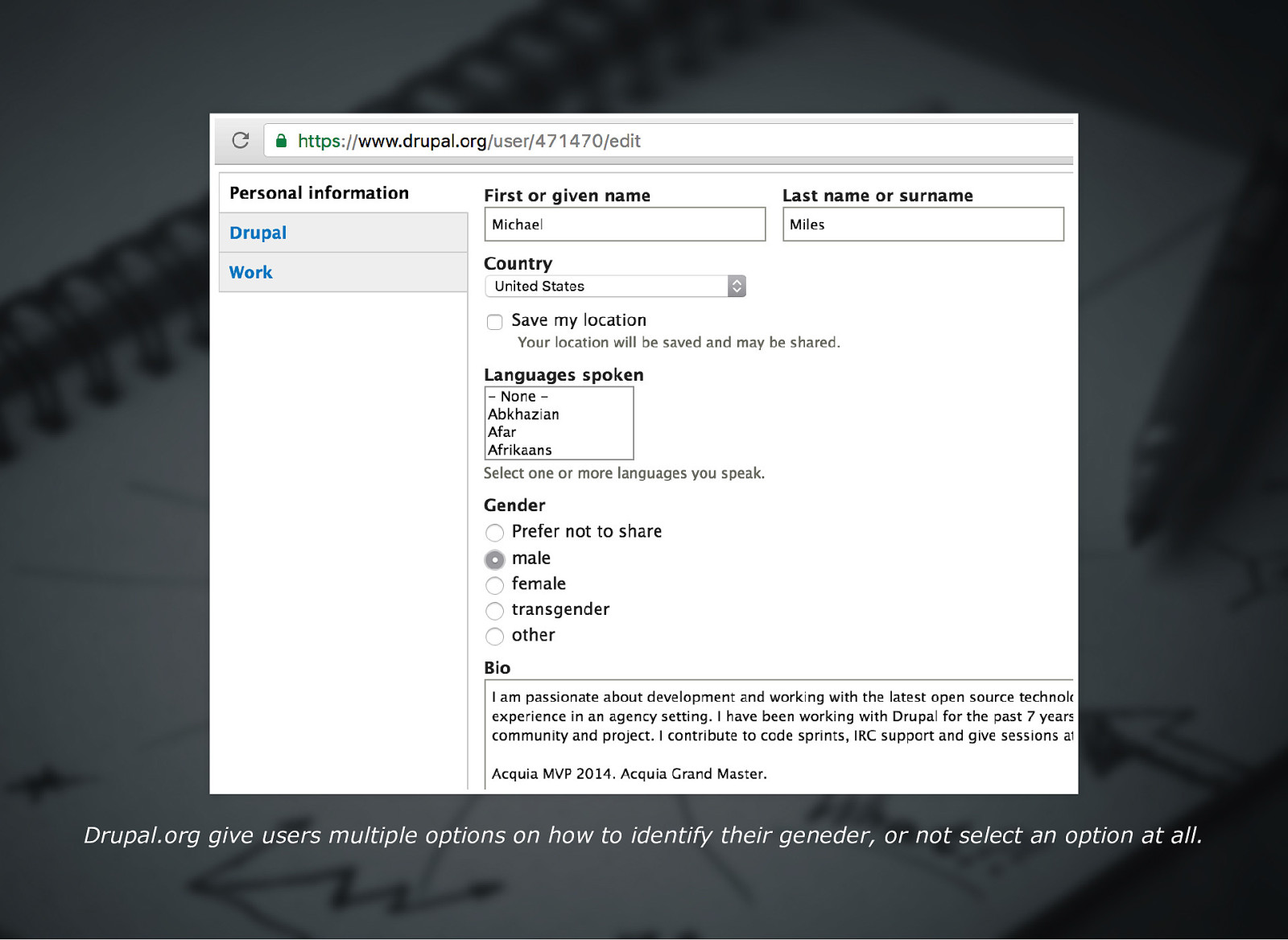
Drupal.org give users multiple options on how to identify their geneder, or not select an option at all.
Slide 33

Collect only the information you need Ask “Why do we need this data?” Ask “What options can we give users?” Ask “Why should users give this to us?”
Slide 34
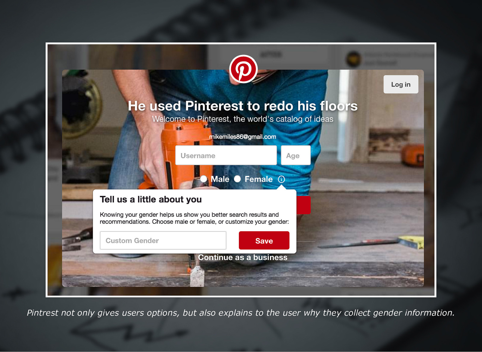
Pintrest not only gives users options, but also explains to the user why they collect gender information.
Slide 35
Be responsible with data Explain how the data is used Explain how the data is protected Give users control of their data
Slide 36
Four Pillars of Inclusive Design I. II. III. IV. No user is average Every user deserves equal access Provide understandable content for every user Every user deserves our trust and respect If we agree to these four pillars when building our applications, then we have to think differently.
Slide 37
We make a positive impact on as many people as possible And if we follow the four pillars, then we will reach a wider audience.
Slide 38
Resources bit.ly/NJCampIDX This presentation bit.ly/IDXPrinciples bit.ly/NJCampIDXSlides Presentation Slides bit.ly/IDXAvgMyth 10 Principles of Inclusive Design The Myth of Average bit.ly/IDXSemBBC bit.ly/IDXGender BBC Semantic guidelines Inclusive Design: Excluding No Gender
Slide 39

Thank You! @mikemiles86 @DrupalCampNJ #InventTogether Inclusive Design / Michael Miles